
How to read Beachman's stock charts
My favorite technical indicators and how I use them on charts for investing and trading

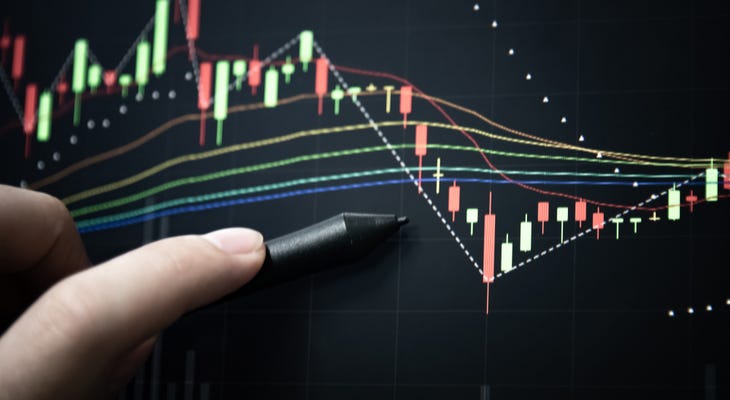
At the beach, we continue to experiment with chart setups and technical indicators using TradingView. I have written and tested several pine scripts to generate signals for reliably buying, selling and trimming positions.
This post will introduce the chart setup and technical indicators that I use for both investing and trading.
As we setup a new baseline approach for investing on beachman.substack.com and trading on beachmantrades.substack.com…it becomes imperative to have consistent, informative and most importantly…ACTIONABLE charts.
Please bookmark this post as needed for easy future reference…
Welcome to Beachman's Investing Brief, where we invest in market-leading stocks and ETFs with a proven record, while taking a long-term horizon and a lower risk approach.
Thank you for your time and for your readership. We continue to grow because you support us, you share our work with others, you contribute to and nurture our community in many ways. Please keep those likes, comments and questions coming and consider becoming a free or paid subscriber today.
As a paid subscriber, you will receive frequent actionable posts about investing, markets and portfolio management, exclusive access to Beachman's best SWAT (Sleep well and tight) stock and ETF picks, informative stock charts with preferred BUY & TRIM price points, BUY, SELL, OVERBOUGHT & OVERSOLD signals, Beachman’s 3D scores for about 50 stocks on his watchlist, access to a dedicated paid-subscribers-only, real-time chat where Beachman provides timely, intra-day notes, subscriber alerts on all his buys, sells and trims and regular updates on the top market signals that you need to know as an investor…AND…the context and key takeaway for each of these developments.
Keeping it simple
I like to keep things simple when it comes to my investing process. I look at a ton of underlying data and several metrics for a given company. However, I prefer to boil things down to a few attributes that really matter to me, with a strong preference for leading indicators and trends.
I follow the same mantra when it comes to stock charts. Fewer indicators that provide the most actionable information at any point in time.
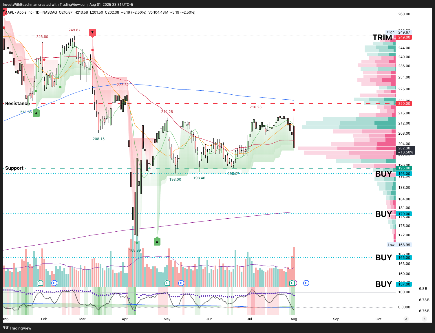
Let’s use the 1day chart for AAPL below as an example.
Technical indicators
This is the chart setup that I use most frequently. My charts have two sections with several unique indicators in each. I usually look at about 6 months of daily price history on a logarithmic price scale (right axis).
Main section
Daily price candles (RED and GREEN candles).
8-day simple moving average (GREEN line) depicts 8 days’ price history.
20-day simple moving average (ORANGE line) which tracks 1 month’s price.
50-day simple moving average (RED line) depicts 3 months’ price history.
200-day simple moving average (BLUE line) shows what happened over the past 1 year.
200-week simple moving average (PURPLE line) shows what happened over the past 4 years.
Price volume profile (Horizontal RED or GREEN bars) denoting collective buy or sell tendency at each price level for the timeline on the chart.
Daily trading volume (GREEN vertical bars indicate more buying versus selling that day & RED vertical bars indicate the opposite).
20-day simple moving average (PURPLE line) denoting 1 month’s average daily trading volume.
Key indicators
Beachman’s preferred buy price points (“BUY” black text & GREEN dotted horizontal lines).
Beachman’s preferred trim price points (RED dotted horizontal lines).
Resistance (Thick RED dashed horizontal line) where the stock could face downside pressure.
Support (Thick GREEN dashed horizontal line) where the stock could experience strong buying.
BUY signal (GREEN up arrow) that marks a bullish shift & strong upward, positive price momentum.
SELL signal (RED down arrow) that marks a bearish shift & strong downward, negative price momentum.
Lower section
Unbound RSI (GREY line), a more sensitive relative strength indicator.
Overbought / Oversold (vertical RED or GREEN thicker shaded lines).
Volume Flow (horizontal GREEN or RED shaded area).
Volume Flow 20-day simple moving average (BLUE line).
Price Volume Trend (PURPLE dots) showing the daily money flow trend.
What Beachman looks for
Reading charts, often, seems to be more of an art than a science. However, the indicators above help me eliminate much of the ambiguity so that I can clearly decide what to do next.
BUY and SELL signals
Those GREEN up arrows and RED down arrows (in the main section) tell me when there is a bullish pivot towards strong upward, positive price momentum….and vice versa. I may use them (on the 1d chart) to enter a new position, to add to an existing position or to trim a current holding. I could also use them to identify when a stock may have truly bottomed or is ripe for a significant tumble lower. I have back tested this signal against multiple, past market drops and surges. It seems to be quite reliable, except in choppy, sideways price action.
Buy and Trim price points
To find good buy price points, I look for where the stock has found price support in the past. These are often where the stock has tested the price level multiple times and subsequently either stayed there or moved higher. The more times the stock has tested that particular price, the more reliable it is for future buying.
The 50DMA and 200DMA are often solid buy points because trading algorithms use them as buy price points.
The horizontal volume profile bars show how much & the nature of trading volume that took place at each price level. A RED bar denotes that there was more selling at that price versus a GREEN bar signaling more buying at that price.
Now, all of this works in reverse for trim price points…meaning upper resistance that the stock struggles to cross above.
My preferred Buy and Trim price points combined with the BUY and SELL signals discussed above can serve as very strong indicators for an investor or trader.
Mean reversion
In the lower section of the chart, the vertical RED or GREEN shaded lines tell us if a stock is overbought or oversold respectively. The darker the color, the more valid and actionable the signal.
An unbound RSI below the 0.00 level along with the GREEN oversold signal strongly denotes that the stock is oversold and ready to mean-reverse higher.
An unbound RSI above the 100 level together with a RED overbought signal serves as a warning that the stock is overbought and could revert lower.
Now if these mean reversion signals coincide with my preferred BUY price points or Trim price points as well as the BUY and SELL signals…well, that’s an I-must-do-something Holy Trinity on a chart…Alleluia!
Price trend
When a shorter time frame moving average crosses above a longer time frame moving average, it usually denotes bullish, higher demand for the stock. 50DMA crossing above the 200DMA is called a golden cross (bullish signal) and vice versa is called a death cross (bearish signal). The crossovers between the 20DMA and 50DMA are useful for trend following. Similarly the 8DMA and 20DMA can be used effectively for momentum trading.
In the AAPL chart above, a death cross formed in Apr and the stock has been stuck below the 200DMA ever since. The back and forth between the 8DMA and 20DMA confirm that the stock has been range bound for 3 months now.
More buyers or sellers?
The volume flow indicators in the bottom section tell us if there is more buying or selling of the stock over a longer time period. This information is not actionable in the moment. It is only useful as a broad signal over a 3 to 6 month or longer time period.
After healthy buying volume in early 2025, more selling of AAPL stock has picked up recently.
Everyone has their preferences for how they digest information and how they communicate with others. Similarly, investors tend to lean on their personal favorites when it comes to technical indicators on a stock chart.
For me, an indicator should be actionable or else it is just noise on the screen. I like to try out new chart indicators, but I quickly take them off it they are not helping.
Less is more when it comes to technical charts.
Oh btw, irrespective of what all the signals are telling us, sometimes the best course of action is to sit on our hands and do nothing.
As a paid subscriber, you will receive frequent actionable posts about investing, markets and portfolio management, exclusive access to Beachman's best SWAT (Sleep well and tight) stock and ETF picks, informative stock charts with preferred BUY & TRIM price points, BUY, SELL, OVERBOUGHT & OVERSOLD signals, Beachman’s 3D scores for about 50 stocks on his watchlist, access to a dedicated paid-subscribers-only, real-time chat where Beachman provides timely, intra-day notes, subscriber alerts on all his buys, sells and trims and regular updates on the top market signals that you need to know as an investor…AND…the context and key takeaway for each of these developments.